Project Parts
The project is split up into a few different parts.
Datasets
In order to do these analyses we needed access to relevant data. The books, movie scripts, wiki pages and sentiment scores where downloaded from the web.
Books
Analysis of original seven Harry Potter books. What are the differences in word usage between the books? How is the sentiment evolving over time?
Movie Scripts
Analysis of the eight Harry Potter movie scripts will shed light on the differences between the films. Which characters are most sentimental?
Wiki fandom
The fandom contains a lot of information about the characters and how they connect with each other. How can this information be used to build a network?
Comparisons
Are there differences between the books, movies and wikis? Do they generate different networks?. Are there differences in sentiment?
More magic
Interested in seeing even more magic? Explore the universe through a more interactive experience!
Video
Do you want to get a quick overview about the project?
Then check out the video to the side!
It explains the basic idea behind the project and goes through the steps that need to be completed in order for the analysis to be possible.
Datasets
Book analysis
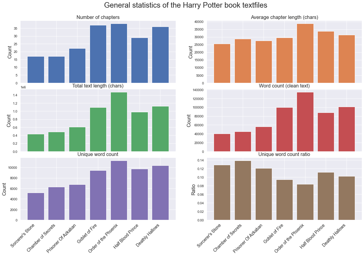
From the books dataset, each textfile was cleaned by using tokenization, lemmitization and all stopwords were removed. After that the text is referred to as clean. The main information about each book was then extracted, namely:
- Number of chapters
- Average chapter length
- Total length
- Number of words
- Number of unique words
- Unique word count ratio
From the above bar plot some interesting things can be seen:
- Order of the Phoenix is the book with the highest number of chapters and the longest chapters on average. Therefore it is not surprising that it also has the longest total text and the highest word count after the text cleanup. It is also the book with the highest number of unique word. However, when the unique word ratio count is examined, the Order of the Phoenix is actually the book with the lowest number. This means that the vocabulary of the book is actually the least diverse of all the books. So the extra length is a result of words that are used in other places of the book.
- While the first two books, Sorcerer's Stone and Chamber of Secrets are the shortest, with respect to both text length and clean word count, these two books have the highest unique word count ratio. This means that the vocabulary usage is more diverse, with respect to length, than of the other books.
- The total text length follows the word count of the clean text perfectly. This means that no one book was more effected by the clean-up process then another book was.
Lexical dispersion analysis
One interesting analysis that can be performed on text is a Lexical dispersion analysis. This analysis will visually display where in the list of all words a specified term is used. Since our dataset includes seven books it would be interesting to see where in the series certain terms appear and if some information can be extracted from the visualization. The analysis will be done on the cleaned text, so that the similar terms of the same word, all group under a single version of the term.
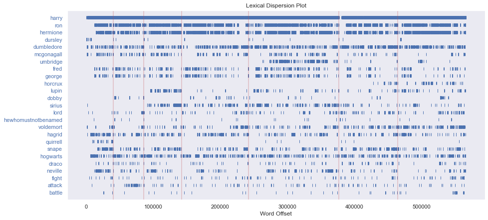
Eventhough the lexical dispersion plot is relatively simple, it still highlights some interesting things from the books:
- Harry is clearly the main protagonist and mentioned everywhere in the books, apart from a small section at the beginning of the sixth book.
- Ron and Hermione are the other main characteres and are introduced at a slightly later point in the first book.
- The Dursley family is clearly mentioned infrequently, but consistently at the beginning of each book.
- Some characters are introduced at a later point in the series, such as Umbridge, Lupin, Sirius and Dobby.
- Fred and George seem to be mentioned in the same pattern, meaning that they appear to be mentioned at similar times. This makes sense, as they are twins and therefore often appear together.
- Some words are mentioned a lot more frequently later in the series, such as Voldemort.
- Similarly the word horcrux is introduced in the sixth book and continues to be frequently mentioned in the last book.
Term frequency (TF) analysis
The next analysis that will be interesting to perform on the books dataset is a term frequency analysis. Here the idea is to extract which terms are most common in each book and in the books overall.
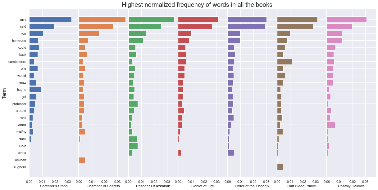
From the above figure it can be seen that the proportionally most frequent terms in all books are, harry followed by said and then ron and hermione. In the clean word list for each book, close to 3 out of 100 words are harry. The ratio remains pretty consistent between the books, although it is highest in books 2 and 3, Chamber of Secrets and Prisoner of Azkaban.
This is not surprising.
However the graph above highlights some interesting aspects of the books. It shows that Dumbledore is most prominent in book 6, Half Blood Prince. It also shows how hagrid is much more prominent in the first book, than in the rest of the series. wand becomes much more prominent in the last book, Deathly Hallows and similarly the malfoy family seems to be most prominent in book 2, Chamber of Secrets. Additionally the appearence of some prominent characters are clear, with black and lupin appearing in book 3, Prisoner of Azkaban. sirius becomes more prominent in the Order of the Pheonix, lockhart in the Chamber of Secrets and slughorn in the Half Blood Prince.
It's interesting to see how much information relating to main secondary characters and themes of each book can be seen from such a relatively simple plot.
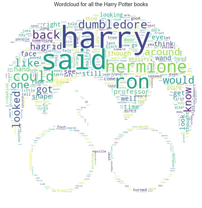
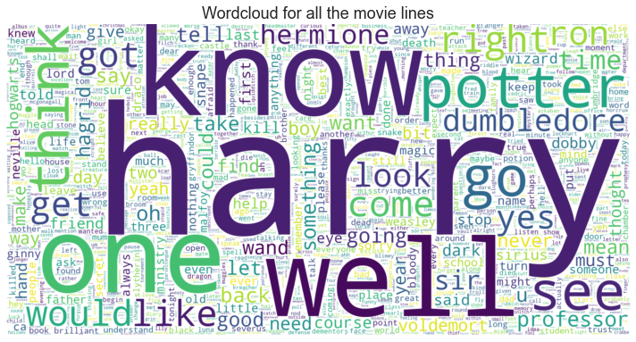
Another interesting way to visualize and explore term frequencies are word clouds. To see what the overall words used in the Harry Potter book series are, a frequency distribution was generated using the whole cleaned text. Then a wordcloud was generated using the WordCloud plotting function.
Term frequency - Inverse document frequency (TF-IDF) analysis
The next analysis that will be interesting to perform on the books dataset is a term frequency - inverse document frequency analysis. Here the idea is to extract which terms are most common in each book with respect to how common they are overall. This analysis is meant to extract the terms that are most specific to each groups, such as characters or topics.
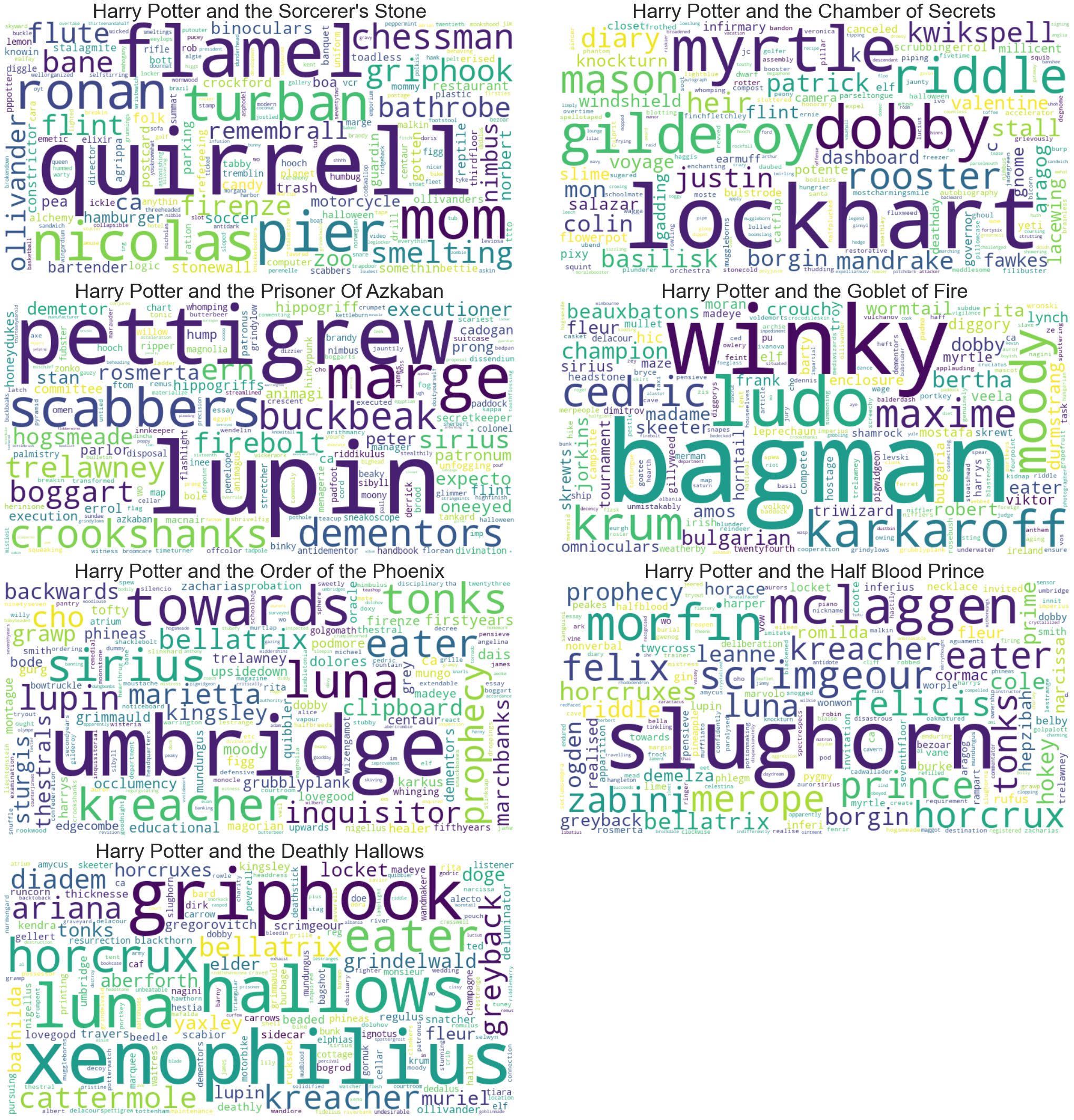
From the above wordclouds it is clear that they contain very different information from the original wordcloud created using all the Harry Potter books. These wordclouds capture the differences between the books in the series and highlight the most important characters or topics:
- Sorcerer's Stone: Here the main terms relating to characters are most notably Quirrel, Nicolas Flamel, Ronan and Pier. Some words that seem to be more distinctive in this books are: turban, chessman, mom and flute. This all relates very well to what is known to be the storyline of the book. Where Professor Quirrell is a prominent character which wears a turban. The flute and chessman were important to the adventures of retrieving the sorcerer's stone created by Nicolas Flamel
- Chamber of Secrets: Here the main terms relating to characters are Gilderoy Lockhart, Dobby, Myrtle and Riddle which all were prominent in the second book. Some other things that played a big role in the book are diary, basilisk and rooster
- Prisoner Of Azkaban: Here some newly introduced characters are prominent, such as could be seen from the lexical dispersion plot and frequency term plots. Lupin is introduced but other characters such as Marge, Pettigrew, Ron's rat Scabbers, Hermione's cat Crookshanks and Buckbeak are prominent. Some other terms that occur frequently in the book are boggart, dementors and firebolt
- Goblet of Fire: Here again some characters take the center stage. Ludo Bagman and Winky take center stage in this wordcloud, but are surrounded by other characters such as Moody, Karkaroff, Krum, Cedric and Maxime. Other things that are prominent are beuxbatons, bulgarian and champion. However the size of these objects are relatively small compared to the character name sizes. This is not surprising as this book introduces a lot of characters from other wizarding schools which do not appear in other books, so these would take center stage in the TF-IDF of the book.
- Order of the Phoenix: Here characters are the most prominent in the wordcloud. Umbridge is the main villain in the book but other characters include Kreacher, Sirius, Tonks, Lupin, Cho and Bellatrix. Other terms such as towards and backward are for some reason very prominent. Inquisitor and prophecy are also among the most prominent non-character words, with inquisitor referring to the Inquisitorial Squad founded by Umbridge
- Half Blood Prince: Not surprisingly character names are still most prominent, Slughorn, McLaggen, Morfin, Scrimgeour, Luna, Merope and Zabini. Some other terms include Felix Felicis the luck potion, prince, relating to the half-blood prince, and prohecy.
- Deathly Hallows: There some objects are prominent, such as hallows, referring to the Deathly Hallows. Horcrux is also a very frequently mention term in the book as can be seen. Additionally diadem and locket can also be seen, which both relate to being used as a horcrux. However again there are mostly character names that are more distinctive for this particular book in the series. Here Xenophilius and Griphook are the most prominent, along with Ariana, Greyback, Cattermole and Kreacher.
Word category analysis
The words of a text can be categorised into different types or categories, such as nouns and adjectives. Each author has a different style and the writing style might even change over time. Therefore it might be interesting to see the distribution between the usage of different word categories for each book, and explore if these change over time.
In order to do so the pos_tag function from the NLTK package can be used. It categorizes the words and marks them with a word category code:
| Code | Word Category |
|---|---|
| NN | Noun singular |
| JJ | Adjective |
| VBD | Verb past tense |
| RB | Adverb |
| VBG | verb present participle |
| IN | preposition |
| VBN | verb past participle |
| VB | verb base |
| VBP | verb present tense |
| MD | modal |
| NNS | noun plural |
| CD | cardinal numbers |
The analysis will be done on the previously cleaned text, just to simply the comparison a bit. The first analysis done will be a comparison between the word type usage of the different books. That way it should become clear if one book uses more of any one type of word category, or if the usage is uniform between all the books.
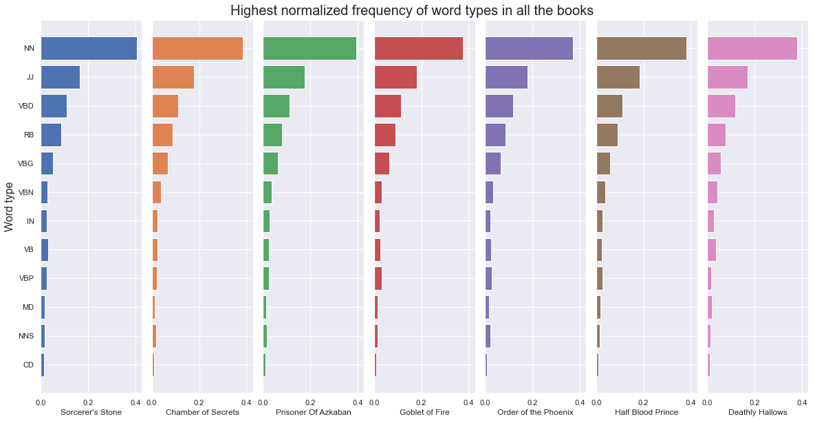
From the above figure we can see that all of the books follow a similar pattern. The most common word category is a singular noun (NN) followed by adjectives (JJ) and verbs in past tense (VBD). Then there are adverbs (RB), verbs in present participle (VBG) followed by the rest of the word categories in smaller frequencies.
Another thing that could perhaps shine a light on the differences between the books is how unique in usage each of the word types are for the books. By plotting the distinct count of word for each word category and dividing by the total number of words in the category, the ratios can be compared between the books.
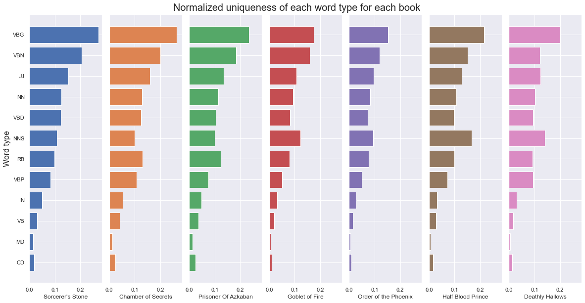
From the above figure it can be seen that again the books follow a pretty similar pattern, but here there are more distinctions from the previous figure.
The Order of the Phoenix clearly has the lowest ratio for verbs in present participle (VBG). This could be since this is the longest books, so it can be expected that each unique word is used relatively more frequently. Another interesting thing is that the Half Blood Prince has by far the highest ratio of plural nouns (NNS). So it seems that the plural form is used more in that book compared to the others. However, it is important to note that the words have already been through a lemmitization process, where the inflected forms of a word are groupped together so that they can be analysed as a single item. Therefore these results might not correlate directly with the original word usage in the books.
Sentiment analysis
In this section a sentiment analysis will be performed on the Harry Potter books. First the average sentiment over each book will be explored and later on the average sentiment of each chapter will be explored.
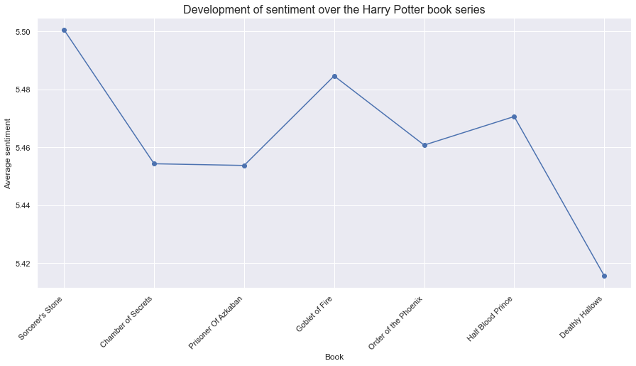
From the above graph it can be seen that the first book, Sorcerer's Stone, has the highest sentiment, 5.5, indicating that the language used there is slightly 'happier' than the other books. Then books 2 and 3, Chamber of Secrets and Prisoner of Azkaban, have much lower values than the first book, with similar values of around 5.455. Then there is a slight spike for book four, Goblet of Fire, followed with another drop in value for book 5, Order of the Phoenix. The differences here are of lower scale than the original first drop discussed. Then the sentiment value increases slightly for the sixth book, Half Blood Prince, but then for the final book it drops down to a value below 5.42. This means that the seventh and last book, Deathly Hallows, has around 0,08 lower sentimental value than the first book and is the book in the series with the leasty happy word usage. This is not really surprising as the books do get increasingly dark as the series progresses and the main characters face more difficult challenges.
Finally to get a slightly clearer image of the development of sentiment over time the average sentiment was computed for each chapter. Then more datapoints could be seen along with the differences between the sentiment of different chapters, with the opportunity of being able to spot which chapter of the series seems to be the darkest one.
The same procedure was used as before, only now for each chapter of the book.
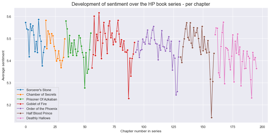
In the graph above the sentiment is plotted for each chapter in the book series. Therefore it is possible to see how the sentiment develops as the series progresses. It can be seen that the sentiment fluctuates between the chapters, sometimes dropping and picking back up in the next chapter. The sentiment for the first two books, Sorcerer's Stone and Chamber of Secrets, stays rougly betwen the values of 5,35 and 5,6. Books 3 and 4, Prisoner of Azkaban and Goblet of Fire, have a greater range in sentiment value than the first two books. Book 5, Order of the Pheonix, seems to have much lower peaks of sentiment than the previous book. The range for book 6, Half Blood Prince, is very drastic and the third to last chapter has the lowest sentiment score of all the chapters in the series, almost close to 5,1. For the last book, the sentiment score fluctuates a lot between consecutive chapters, with a clear downwards slope. However there is not a single chapter there, that clearly has a much lower score, but rather there are six chapters with pretty low sentiment analysis scores.
An interesting thing to do would be to investigate what is happening in the chapter whenever there is a dramatic drop:
-
Prisoner of Azkaban - chapter 17 - Cat, Rat and Dog
This chapter is a slight showdown between some of the characters in the book. Here accusations are flying over who killed whom and therefore that chapter contains words that have a lower sentimental score. This quote is a small sample of a dialog in the chapter which contains words with low sentimental value:
-
Goblet of Fire - chapter 32 - Flesh, Blood and Bone
This chapter includes the murder of Cedric Diggory, which Harry witnesses. So it's not surprising that the sentiment value of the chapter is the lowest of those in this book.
-
Order of the Phoenix - chapter 35 - Beyond the Veil
This chapter has the lowest sentiment value of the chapters up to this point in the series. In this chapter the group is fighting a great battle and are nearly defeated. In the battle Sirius Black is blasted with a spell and dies.
-
Half Blood Prince - chapter 28 - Flight of the Prince
This chapter has the lowest sentiment value of all the chapters in the series. This his however not surprising as in this chapter immediatly following the death of Albus Dumbledore, one of the series most beloved characters. He was killed by Severus Snape, which enraged Harry to pursue Snape through battle in the halls of the school and out onto the grounds, where he attempts to curse Snape.
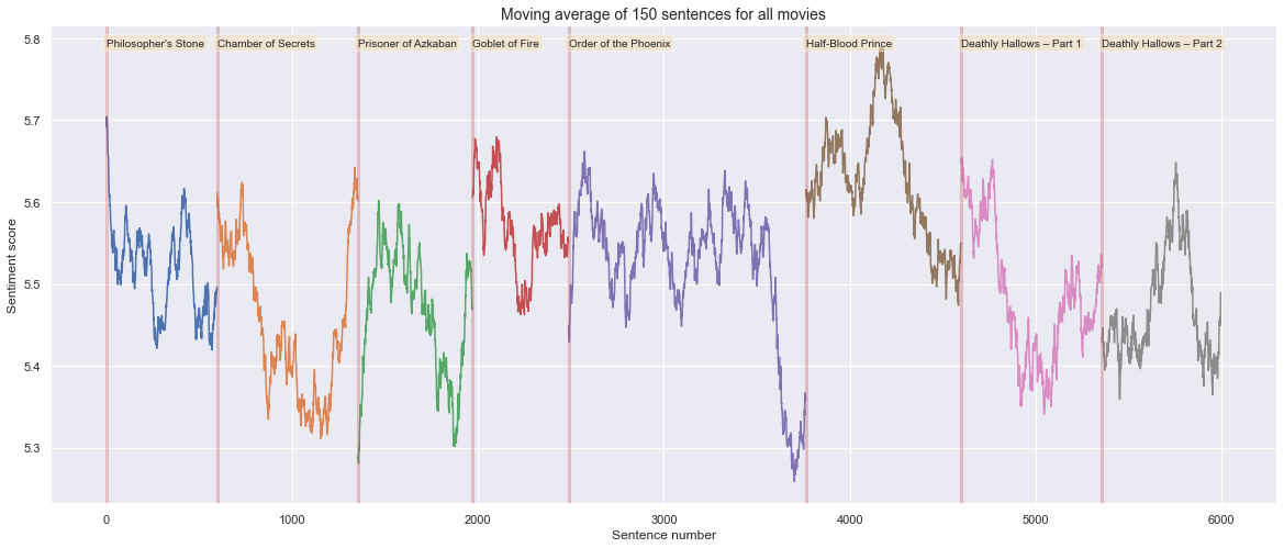
Lastly it can be interesting to compute the moving average of the sentiment using a 5 chapter window. That way the path should become slightly smoother and the trends become more visible.
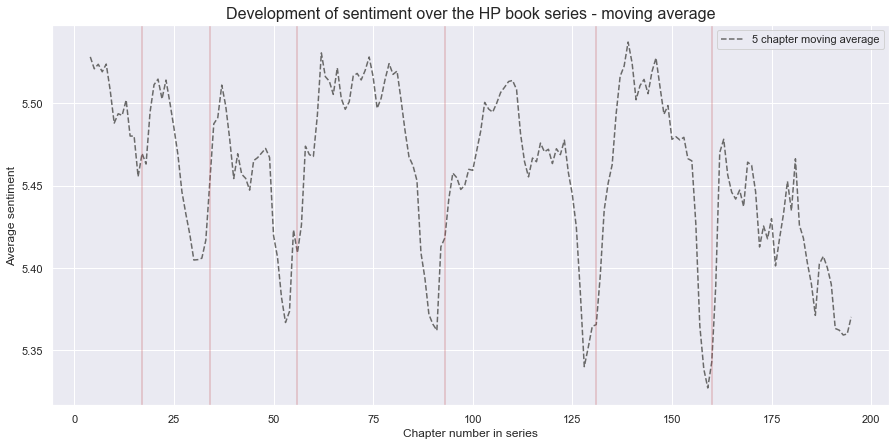
The figure above highlights clearly that there is a downwards trend in sentiment at the end of each book. Generally the books begin with a higher sentiment, fluctuate a little over the chapters and then drop towards the end. The last book clearly has the most general downwards trend of all the books, and also has the lowest average sentiment score.
Script analysis
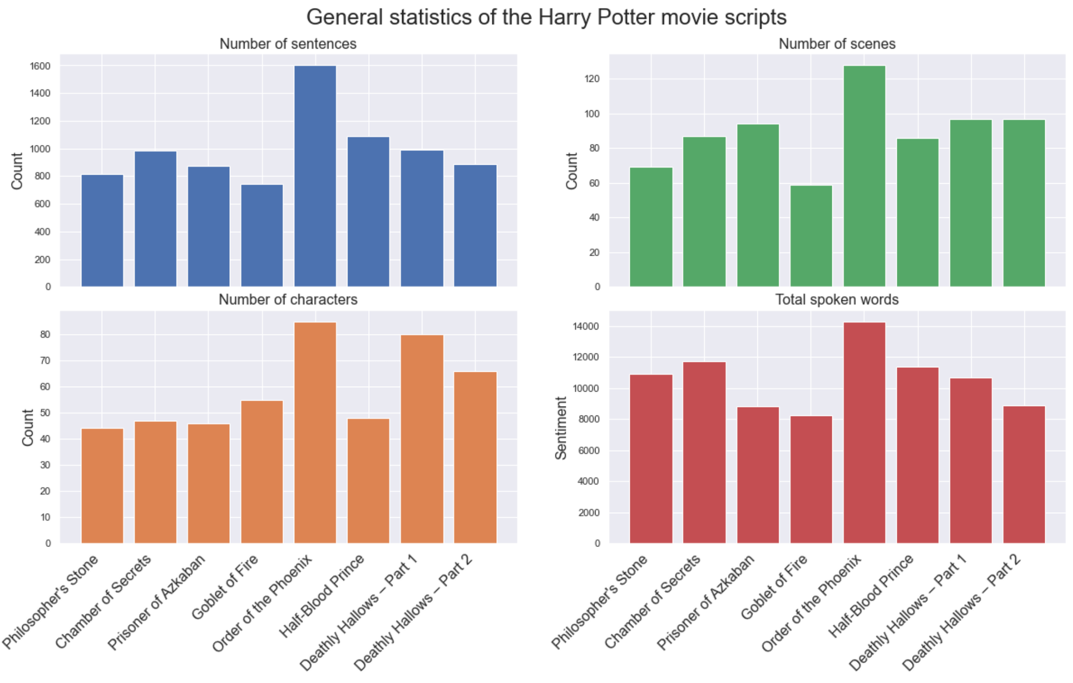
From the scripts dataset, each textfile was cleaned by using tokenization, lemmitization and all stopwords were removed. The main information about each script was then extracted, namely:
- Number of characters
- Number of scenes
- Total length of script
- Number of sentences
In the bar plot above the total count for various statistics can be seen, it is intereasting how the movie Order of the Phoenix has the highest count of all the values. The number of sentences and total spoken words have a clear relation, as expected.
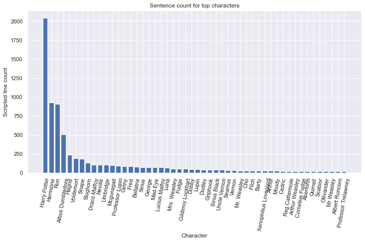
Character analysis
Here we can see how the characters' sentence count is plotted for the top 50 characters of the movies. This plot is based on all the movies and it can be seen how Harry, Hermione and Ron dominate on the top with around 4000 sentences combined, throughout all the movies.
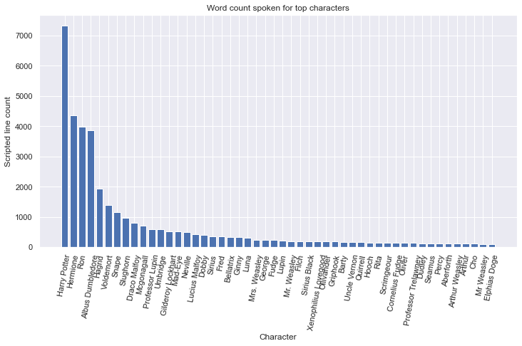
We now look at the total amount of spoken words by the top 50 largest ones. Here again similar to the amount of sentences, the three top characters stay the same. It can be seen that the difference between the trio, and Albus Dumbledore is much less, this indicates that Albus has a higher average sentence length compared to the top 3.
To further investigate the nature of the sentences and what characters are usually speaking longer than others, we take a look at the top 50 average length sentences of all characters.
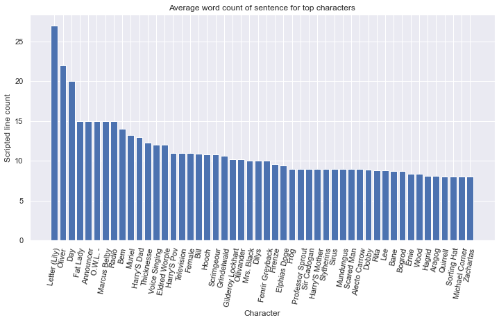
Here we can clearly see that a high average count of words per sentence is for characters that are less dominant in the movies and usually have few but long lines. If we take close look to those characters to understand what they really are:
Here we can see the text spoken by the magical letter written by Harry's mother Lily. Since a letter is usually longer then a character line there is no surprise why this has the longest average sentence out of all characters.
Sentiment analysis
Here the sentiment of the characters and the movies as a whole will be done. A moving average of the changes of happiness and saddness throughout the films will be done. The sentiment for each characters will be gathered and used as an attribute into the network creation later on.
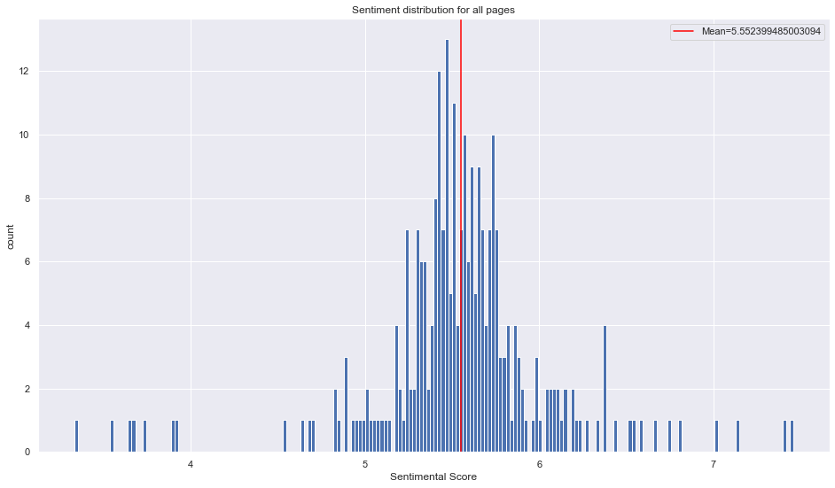
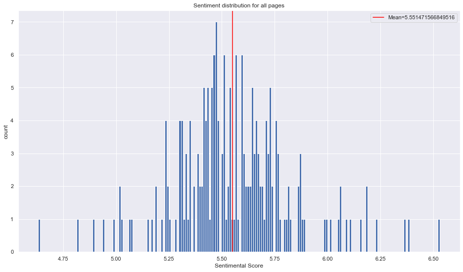
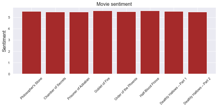
Here the sentiment score for all characters is plotted and the mean included as a red line. The mean is 5.55 which would be consider pretty neutral and more on the positive side. When compared to the wiki-pages, the movies have more dispersion.
Now it will be interesting to look at what the saddest and happiest characters based on the lines in the scripts are.
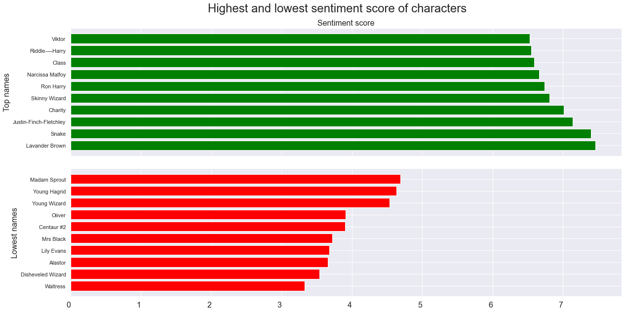
Here the saddest 10 and happiest 10 characters are plotted. If we take a closer look at those characters, we can see that some of them have few lines that happen to be graded with high sentiment score. For instance Snake has the line Thanksssss, which is his only word in the film. To make this more meaningful a minimum limit of words containing a sentiment score will be applied for the filtering of the 10 happiest and saddest characters. Here below a small snippet from the script can be seen where Harry uses his magic by accident to set the snake free, the snake thanks him then in return.
In the figure above a filtering has been applied by the minimum of 5 sentimental words. It can be seen how the dispersion of the sentiment score has changed and the extremes on both ends have gone. This somewhat indicates that when characters have more words they tend to go closer to the average and when fewer words are used the likelihood of going to either extreme is higher. Now with the updated filtering lets look again at the top 10 saddest and happiest characters.
Here we have more interesting characters, if we look at some of the supposed happiest and saddest ones:
- Pettigrew: He is a very submissive character and is very polite and careful in the words he choses.
- Viktor: He is a Quidditch player but if we look at his sentence in the movie, then it is not a nice one.
There is a negative in front of an invitation, where he is banning Rita to be in the tent. This shows how the context of a sentence can be crucial for determining if it is in fact good or bad and it offen happens that the word can be misinterperated.
Now we look at the time aspect of the movies and see how the sentiment changes with time. The moving average of the last 150 sentences is used to compute the sentiment score for each time point.
Wow this is really interesting, we can clearly see many dips in the sentiment score during the movies. Movies clearly tend to be more happy in the beginning and then become more sad in the end. This is in line with what we saw from the books aswell.
Here we can clearly see that just looking at the average doesn't give us much information, it is only when we examine the time period that we see how the sentiment changes throughout the movies.
Term frequency
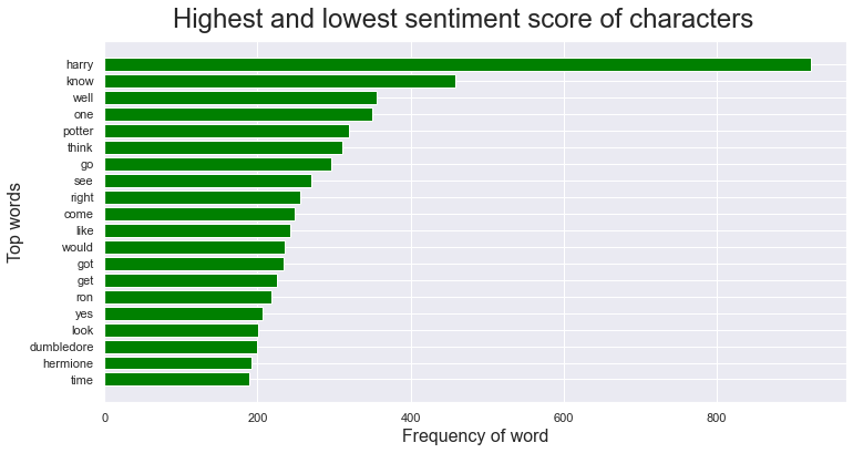
Frequency distribution of the words was created after taking out stopwords and lemmatizing the text. It can be seen that Harry and his second name Potter are the most frequent words with over 800 occurances. The other top words such as, know, one, want and this is similar to the books.
Beolow is a wordlcoud represenation from all the sentences.
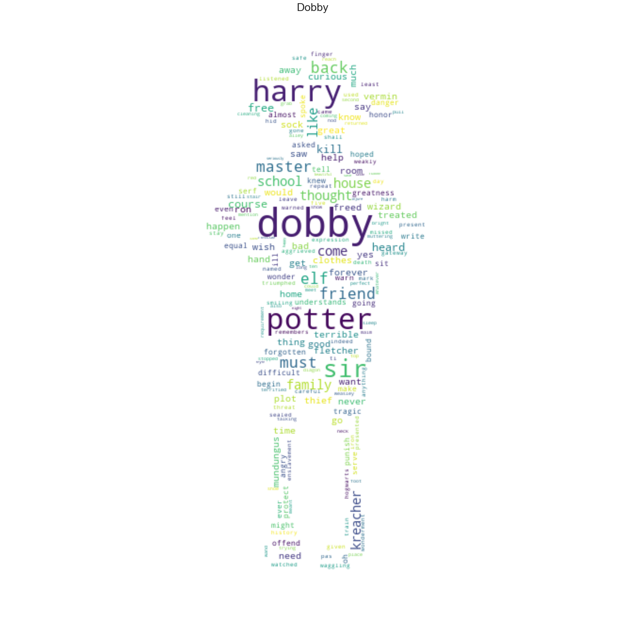
For fun, visualization by the term frequency of some of the characters are plotted based on their figure. Explore the different characters by clicking their names on the left!
Networks
In this section the creation of networks will be done, 2 types of networks are made from the gathered information of the scripts. The first network is based on characters that act in the same scene, and the occurances counted together as a pair. This will show their interactions directly or indirectly during the movies. The second network will be based on how many times the characters mention each other, here we can create a directed graph based on those mentions. Further on, community detection algorithm is used and the found communities are then plotted on a graph with their colors. The communities will be analysed and reasoning for those communities will be discussed.
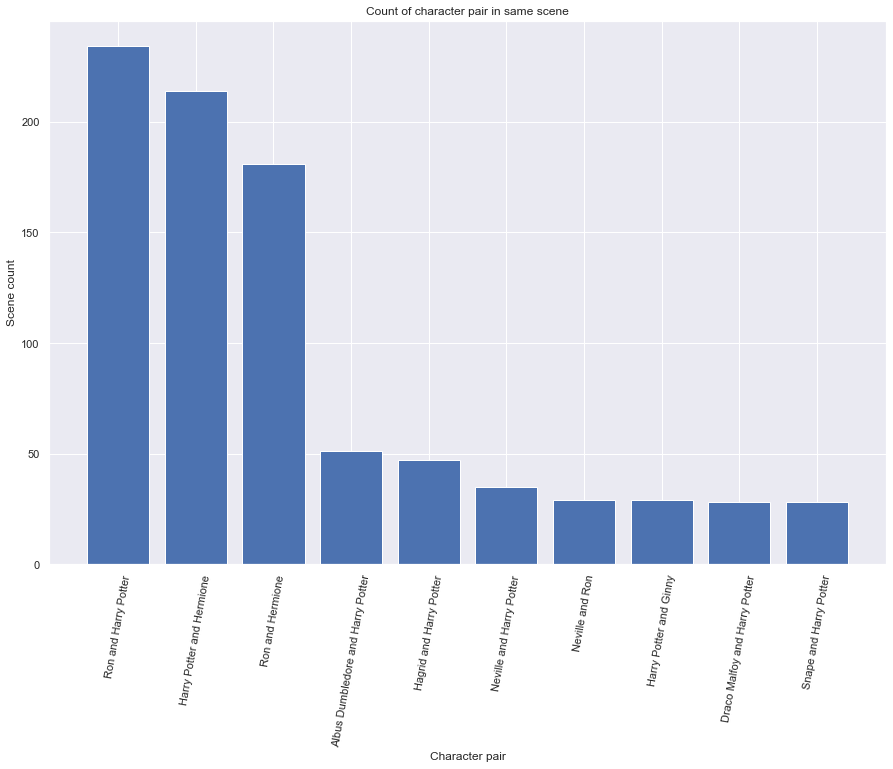
In the figure above the highest interaction pair of characters is plotted. The trio Harry, Ron and Hermione have the most scenes together, after them Harry has most interaction with Albus Dumbledore and Hagrid. Now based on those character pairs a weighted network is created and from that network the Louvain algorithm is used to find communities.
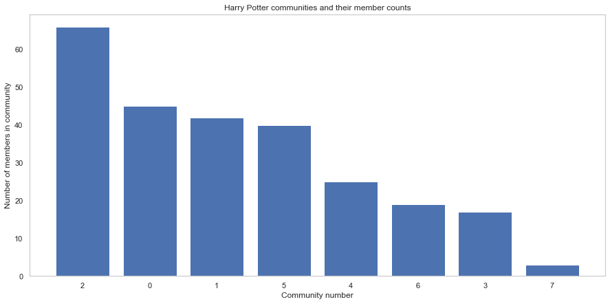
Here we can see some strong communities and the total communities of the network is 7. Now we go into further anlysis and look at the communities indvidually and plot the network based on those communities. The communities are named after their 3 highest connected characters(nodes).
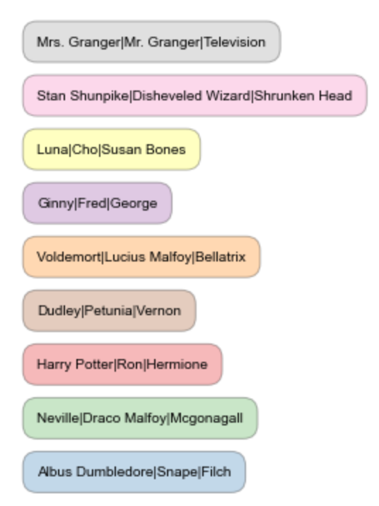
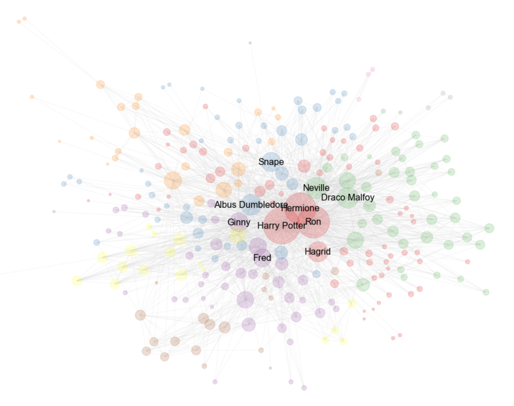
- It can be seen in the network graph above that the dynamic trio are all in the same community along with Hagrid.
- It seems that blue nodes are representing the teachers, such as Snape and Dumbledore. Additionally, Filch is a Hogwarts employee.
- The community colored in purple looks to be a community of Weasley family members.
- The green community seems to be a Hogwarts subcommunity. The prime indicators of this is the network's size, and the fact that it consists of Hogwarts students and a teacher (Professor McGonagall).
- The brown community is quite isolated, and that makes sense as it is clearly a community of Harry's muggle family.
- The orange community seems to consist of dark wizards or death-eaters. The primary villains of the story, Voldemort, Lucious Malfoy and Bellatrix are all in this same community.
- The yellow community consists of Hogwarts student who are secondary characters.
- The grey community consists only of Mr. Granger, Mrs. Granger and their Television. This is probably because of a particular scene in the films.
- The pink community seems to be a Nightbus community. The Disheveled Wizard rode the Nightbus on at least one occasion. Shunpike was a conductor of the nightbus. The Shrunken Head hangs off the rear mirror of the bus.
Sankey diagram of characters in same scenes
Based on the connection between characters that act in the same scena a fancy Snake digram was created. The diagram creates links between characetrs based on the total count of shared scenes. Try it out and hover over the characters to their respective weight and connection!
Trying different method of weighted network
Now instead of looking at the connection between scenes, we turn to the sentences. The sentences are used to link characters together with a directed weighted network, where the weight is determined by how often a character mentions another character. The link is created if a mention exists otherwise there is no link. Here it will be interesting to see what characters talk frequently to or about each other, and how they will be linked.
Below the distribution of the highest mentioned characters can be seen.
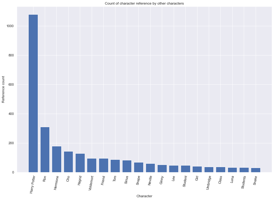
Not surprisingly, we have Harry Potter as the most referenced character, as could be seen in the term frequency analysis. Thereafter come Ron and Hermione and we can, yet again see the relevance of those 3 characters based on mentions.
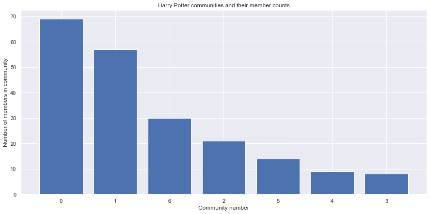
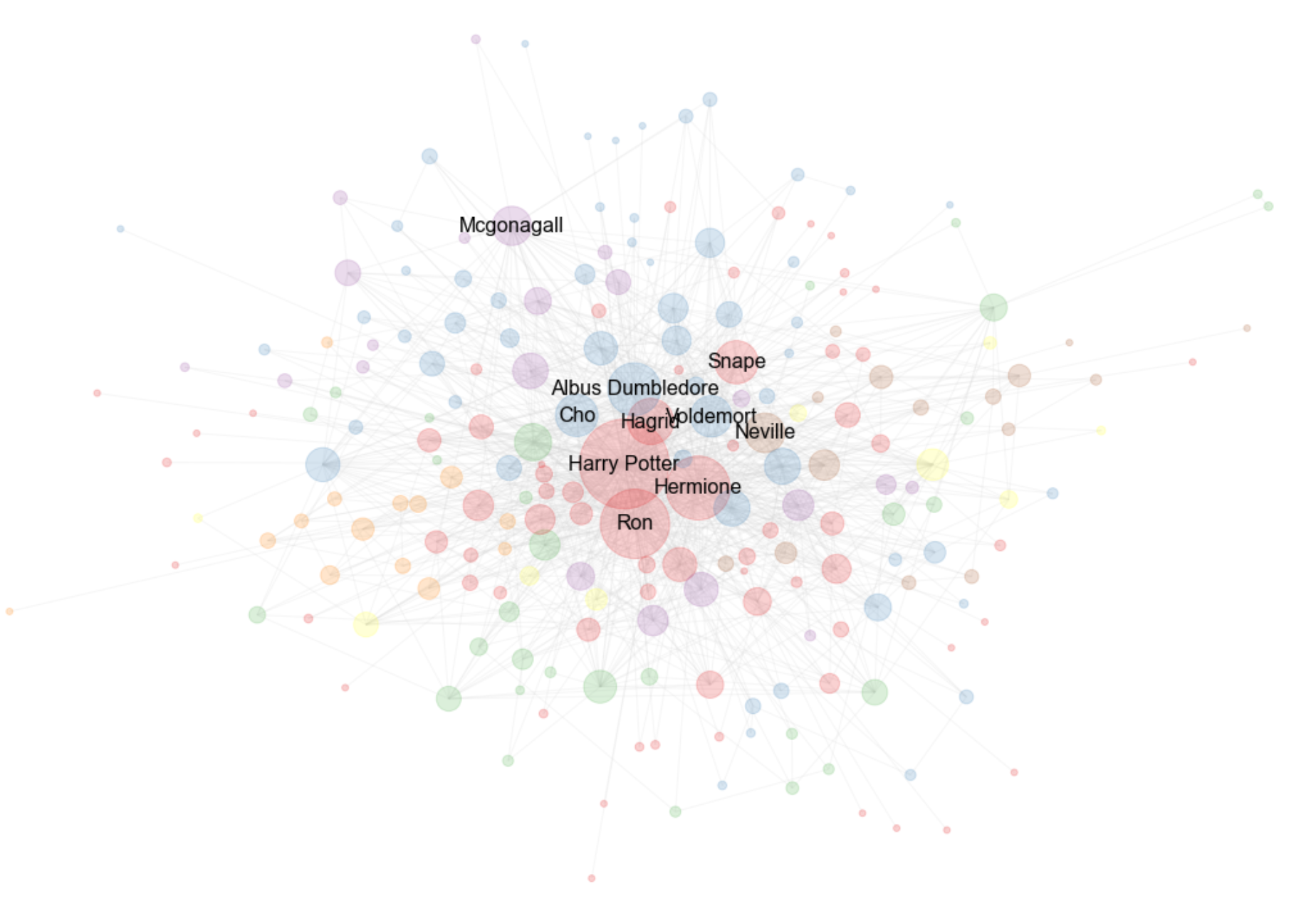
Here the community partitioning is interesting, there are two really big communities followed by 5 smaller ones. The network is drawn based on those communities and colors assigned to the nodes. The communities are named after their 3 highest connected characters(nodes).
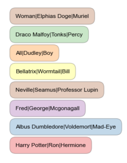
- The blue community seems to include a mixture of teachers, headmasters and Lord Voldemort.
- The red community includes our dynamic trio. Additionally, this community includes the professors and staff of Hogwarts that these students interact with. For good reasons and for bad.
Fandom Wiki analysis
The Wiki pages for all the characters from the books were fetched from the Fandom API. This allowed us to build a network including:
- Character links to other Wikis
- Character Hogwarts houses
- Character blood type (magical or not)
- Even haircolour, and more!
The screenshot above shows the Fandom wiki index. We fetched data from this site and built a Harry Potter universe network from it. Here is our journey:
Wikis - Network creation and visualization
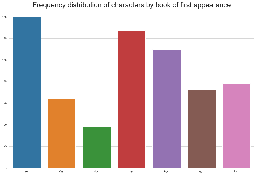
Above we see the distribution of which book the characters belong to (the first book they appeared in). Perhaps unsurprisingly, book 1 (The Philosopher's Stone) has the highest number of first appearances, but book 4 (The Goblet of Fire) and 5 (The Order of the Phoenix) seem to shake things up considerably in the Harry Potter universe. Noticably low is book 3 (Prisoner of Azkaban) with less than 50 characters.
Now let's see how the WikiPage universe might look, with each page connected to its links:
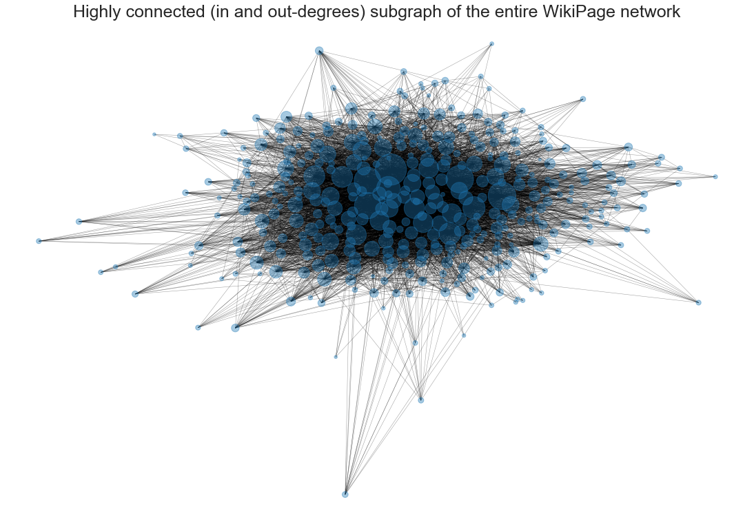
Above you can see an early depiction of the WikiPage network. The nodes of the network are WikiPages, and the links are actual (internet) links to other WikiPages in the network. The size of the nodes are determined by their degree centrality.
This is not the entire WikiPage network depicted here. These are nodes containing at least 4 references to other pages (out-degree) as well as being referenced at least 4 times by other pages (in-degree). This is why we have such a dense middle, and no lonely nodes. This visualisation in particular contains 377 nodes, out of the 788 nodes in the network.
The network does seem to contain a giant component, and some really large nodes, but we'll explore that more later. Now, let's see what the network actually contains:
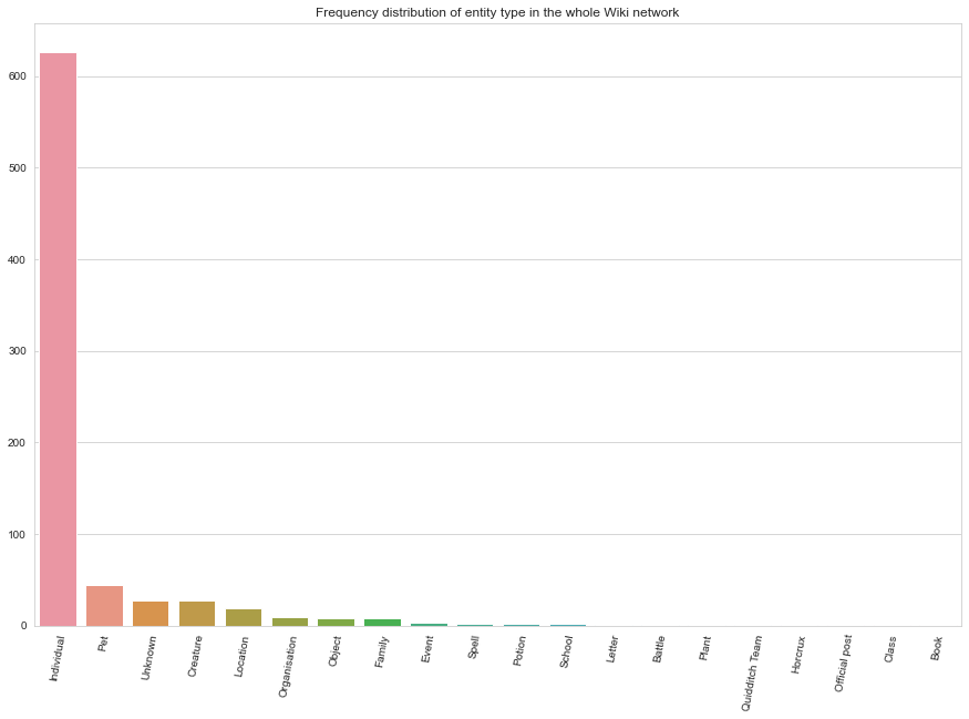
The network mostly consists of Individuals. This is good, because our further analyses will be done on a subgraph of the network containing only individuals. Pets are the second most common, but we have little interest in keeping Locations, Spells, or Quidditch teams for our network analysis.
As such we are going to clean these nodes out. But before we do that, let's see how the degrees are distributed in the whole network:
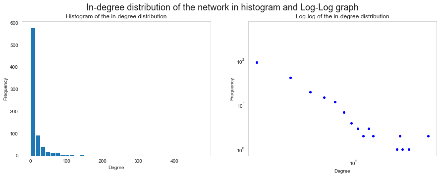
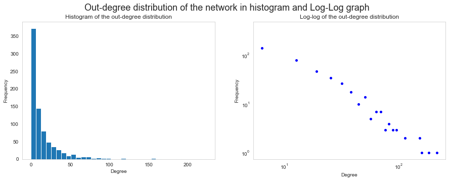
Here we see the in-degree and out-degree distributions in the whole network. Note the substantial amount of nodes around 0 on the in-degree graph, and how far to the right it stretches. This could indicate that the network has hubs (nodes with disproportionally high degree).
Now we can clean out the non-individuals from the network. Let's make a visualisation that makes intuitive sense: Only highly-connected (>3 in-degree and out-degree) individuals with a known Hogwarts house! We should recognise some of these nodes:
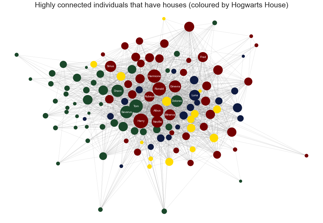
In this network we see our beloved Harry, Ron, Hermione, and others (top nodes are labelled). Notice how the houses tend to cluster together. As you probably know, the house colours are:
- Red: Gryffindor
- Green: Slytherin
- Yellow: Hufflepuff
- Blue: Ravenclaw
The network above only consists of 124 nodes, but you see how it can get more intuitive to look at subgraphs of the real network. This is just one attribute to look at, and the possibilities are many in the WikiPage network!
Now, let's analyse the individuals network.
Wikis - Network statistics and analyses
Here, we want to further analyse the degree distributions of the network (only individuals this time). We will also analyse the different attributes in the network (node type, Hogwarts house etc.) and see their distributions.
Above we can see that the in-degree distribution seems to hover around the bottom a little more than the out-degree distribution. That means that there could be more nodes with very few references elsewhere than there are nodes with few references to other nodes (hope that makes sense).
However, the scales are not equalised here, let's account for this:
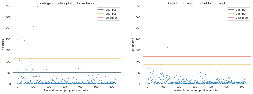
Now we have equalised the Y-axis, and added lines for the high-percentiles. It feels a bit more even now, but notice how the in-degree distribution stretches way higher than the out-degree distribution. This further supports the finding that the network has hubs.
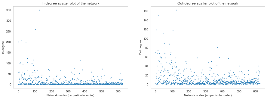
There is one node with such a high in-degree that it's almost out of frame - can you guess who that is? (spoiler - it's right below).
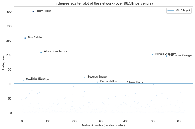
If you guessed Harry Potter then you are of course correct. Above we can see the highest nodes (over 98.5th percentile for both the in-degree and the out-degree distributions. You probably know most of these characters from the books and films, and it is no surprise that Ron, Hermione and Dumbledore are among the top nodes. Note that Tom Riddle also goes by another name, which definitely should not be uttered, in writing or otherwise...
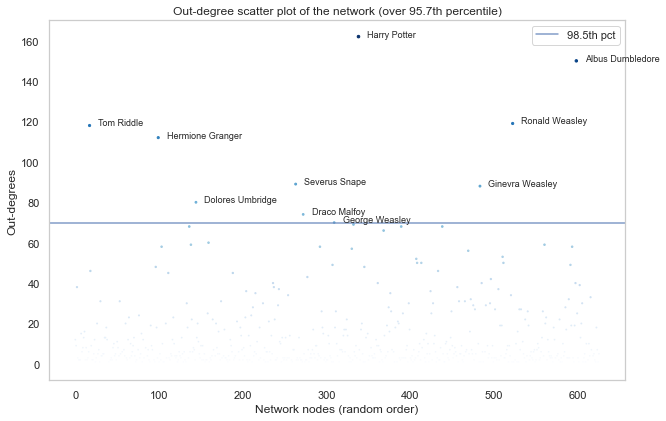
As makes sense from a WikiPage network, the high-percentile out-degree nodes are very similar to the in-degree nodes. This means that these nodes had the most amount of links to other nodes in the network.
This indicates that even though the network has hubs on the in-degree spectrum, those same nodes have the most out-degrees too (albeit lower). This could mean that these high-degree WikiPages have an unfair advantage of being disproportionally updated and referenced - the pages themselves grow larger (because they're already large), and are referenced from other pages (because they're so large, and hence so important)!
But now for some fun exploration, let's analyse the different attributes in the network!
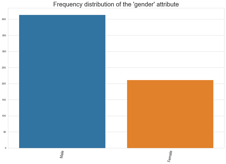
The figure above shows the distribution of the two main genders (Male and Female) in the Individual network. Note that the amount of males is almost double that of the amount of females. This distribution is not particularly surprising when it comes to popular culture and fiction, but perhaps a little bit surprising given that the author of the stories, J.K. Rowling, is female.
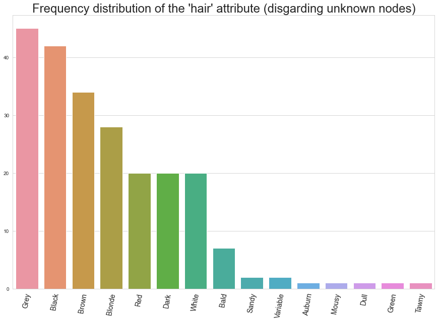
Here we see the distribution of hair colour (or other description of hair) for those that are known in the network. In the wizarding world, it might not be too surprising that grey hair is the most common. Indeed, the Dumbledore look seems to be forever in fashion in the universe, and some great wizards live up to hundreds of years old.
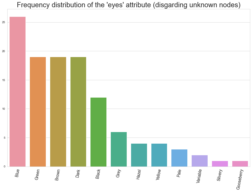
Here we see the distribution of known eye colours in the network. Blue eyes (like Ron) are the most common, with Green (like Harry) and Brown (like Hermione) coming thereafter. 'Dark' and 'Black' are perhaps the most striking results, sounds like villains, doesn't it?
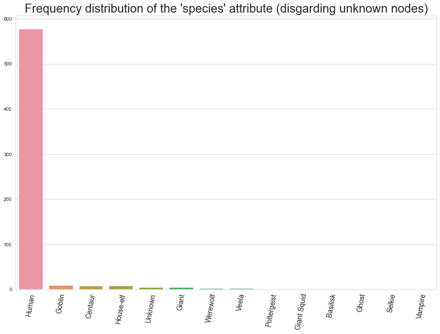
Here we see the distribution of different species in the universe. Of course, humans are the most common. Goblins, house-elfs, centaurs and ghosts should not be unfamiliar to the avid Harry Potter fan, however.
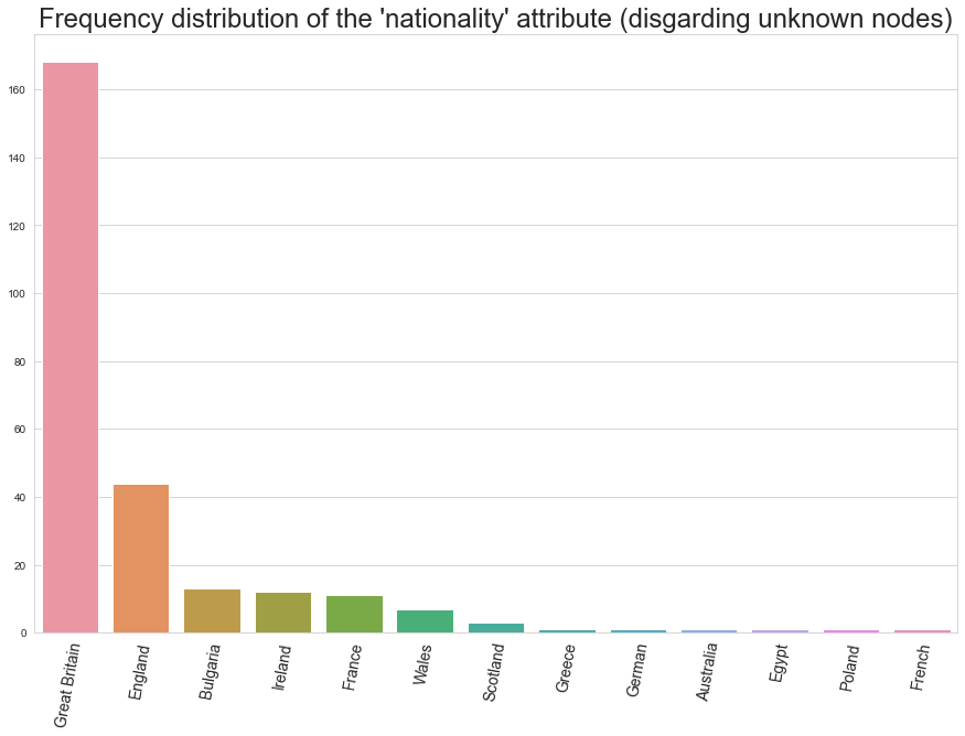
Here, we see the distribution of nationalities in the universe. Unsurprisingly, it's very British. Mostly the characters are from the unspecific Great Britain, with its different parts (Wales, England, Scotland) all being common as well.
Bulgaria is the most common after the British Isles, with France coming third. Can you figure why?
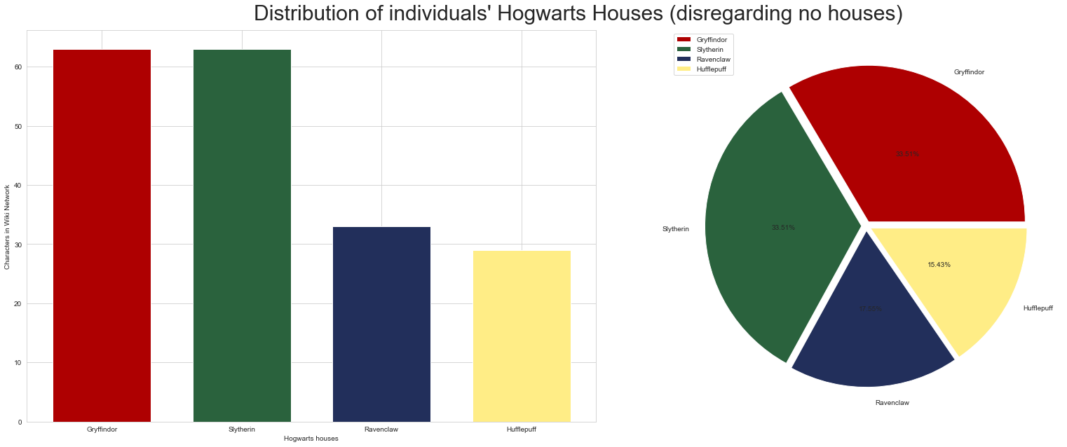
The figure above shows the distributions of Hogwarts houses of the nodes with a known house. The barchart on the left shows the same information as the pieplot on the right.
Perhaps unsurprisingly, Gryffindor and Slytherin are neck and neck with the highest frequencies, with 33% each. Ravenclaw comes third with 17.5% and Hufflepuff sits at the bottom with 15.4%.
This makes sense, as most of the main characters are in Gryffindor and Slytherin, and indeed a large theme of the book is the paralellism between the two houses. This means that many characters (including Harry) are narrowly chosen to one of the houses over the other, based on some character attributes.
One these attributes could be blood type. Let's look at this:
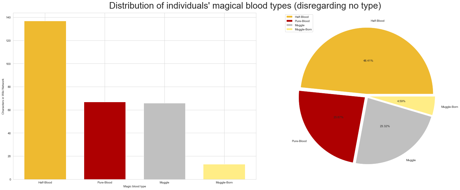
Here we see the same figure as before, but looking at blood type disributions. Blood type refers to the magical heritage in a character's family. It is a hot topic in the stories, as some characters believe that magical powers should stay within magical families.
The Harry Potter universe seems to be mostly populated by half-blood witches and wizards. Pure-bloods and Muggles are also common, with Muggle-born witches and wizards being least common.
Half-bloods are more common than we expected, but this still makes sense as this attribute could include those that have just a somewhat diluted blood type in their family tree. Pure-blood families are very proud, and it is the opinion of some of them that witches and wizards should not mix with muggles.
The founder of the Slytherin house shared that sentiment, and wanted to forbid the teaching of half-bloods and muggles in the Hogwarts school. So much so, that he sealed the Chamber of Secrets and left in it a terrible monster, waiting to one day purge the school of those who are not pure. This is why we anticipate that Slytherin will have a disproportionate number of pure-bloods, as a trace of this characteristic of the house. The following quote is Slytherin's own Draco Malfoy's take on non-pure bloods:
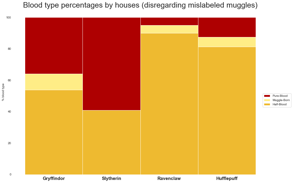
To explore this, here we have the percentages of the different Blood types by houses. This relationship seems to be true, there are proportionally more pure-bloods in Slytherin than the other houses. Gryffindor also has a sizeable amount of pure-bloods, with Ravenclaw and Hufflepuff having very few.
Furthermore, all the houses except Slytherin have at least some muggle-born individuals. This confirms our second hypothesis that Slytherin would not be a likely home to muggle-born students.
Wikis - Community Detection
Now that we've explored the network and its attributes, let's try something a bit more advanced. Here, we try community detection in the network, hoping to find patterns in the link distribution using specialised algorithms to break down the network into modules. Let's see how it worked!
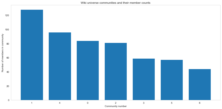
Using the Louvain method, the figure above shows the split of the network in to communities. As can be seen, community 1 has more than 120 nodes, and there are 7 communities in total. This means that the network has been split in to these 7 communities, due to the distribution of the links.
To see whether these communities make sense, let's first explore TF-IDF word clouds generated from their WikiPage texts. This in theory should highlight the unique words used within each community.
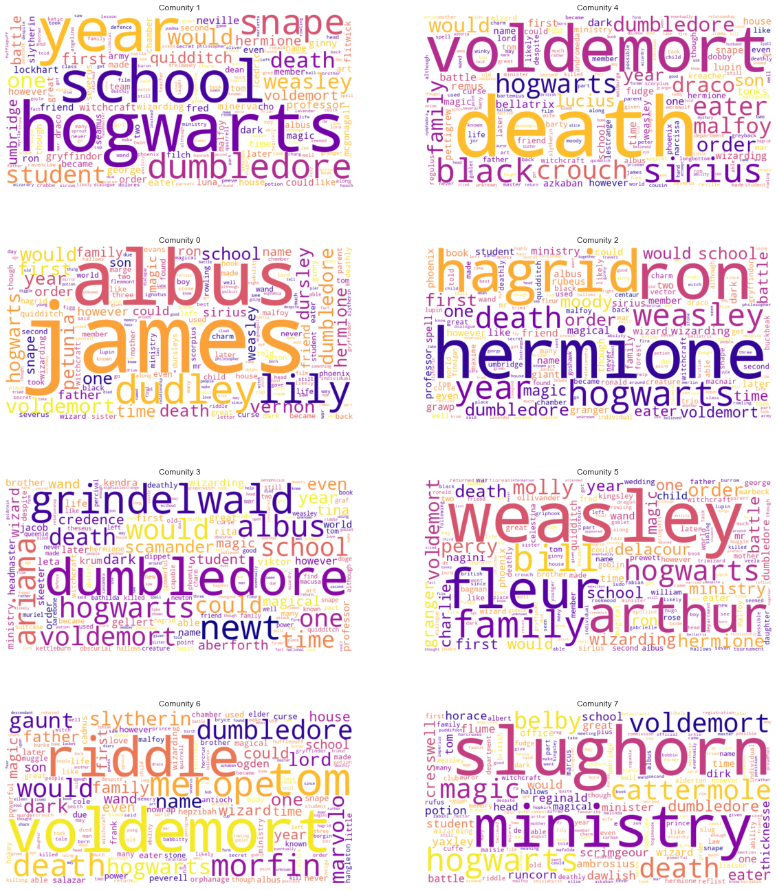
These wordclouds represent the most unique or defining words for each community in the network. Some patterns are noticable, although this could be more revealing. Using our expert domain knowledge of having at least seen all the movies once, these are our thoughts on the different clouds:
- Community 0. A community that seems to revolve around Harry's family. Albus is the name of Harry's son, and James is the name of his father. Lily is his mother, and Dudley, Vernon and Dursley represent his Muggle family.
- Community 1. This community seems to be a subcommunity at Hogwarts. It has to do with school, and perhaps a particular year at school.
- Community 2. Hagrid, Ron and Hermione's community.
- Community 3. A community around Albus Dumbledore, Grindelwald, and perhaps some events that occur before or beyond the Harry Potter books.
- Community 4. A community that seems to revolve around death eaters. Lord Voldemort is a common phrase here, along with the Malfoys. Interestingly, Sirius Black seems to be involved with this community.
- Community 5. Most probably a Weasly family community. Charlie, Percy, Arthur are notable here.
- Community 6. A Voldemort community. Tom and Riddle are very notable, with "Marvolo" being Voldemort's middle-name. 'Gaunt', 'dark' and 'death' are also appropriately common here.
- Community 7. Most probably a Ministry of Magic community.
We will revisit these communities shortly. For now, let's see how they are split when we visualise them!
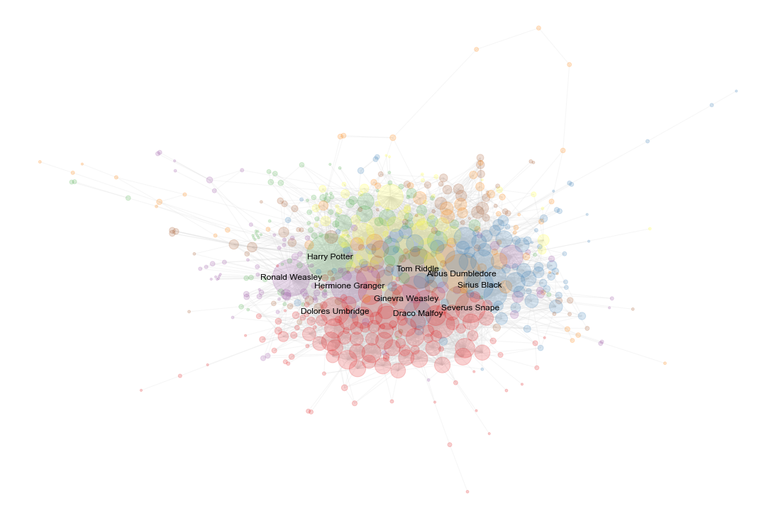
The figure above shows the Giant Connected Component (most highly connected subgraph) of individuals, coloured by their communities. Harry, Hermione and Ron are close to each other as excpected, with Ginny and Draco being closer to Voldemort and other main characters. Note that the colours tend to cluster together, with red being a big community at the bottom (Hogwarts subcommunity).
Although the communities seem to cluster somewhat, there's a good amount of mixing, too.
Wikis - Sentiment analysis
Now we want to analyse the text stored within the WikiPages. Namely - we want to answer how happy or sad it is (known as sentiment).
Using a word list for scoring, we analysed the sentimental value of the different WikiPages. How were the results?

Here we see the frequencies of different sentimental scores for WikiPages (in histogram bins). It's apparent that the sentiment of the WikiPages is not too spread out. This this being said, there are notable outliers around the bottom, below 4.7. Similarly there are a fair few with sentiment over 6.
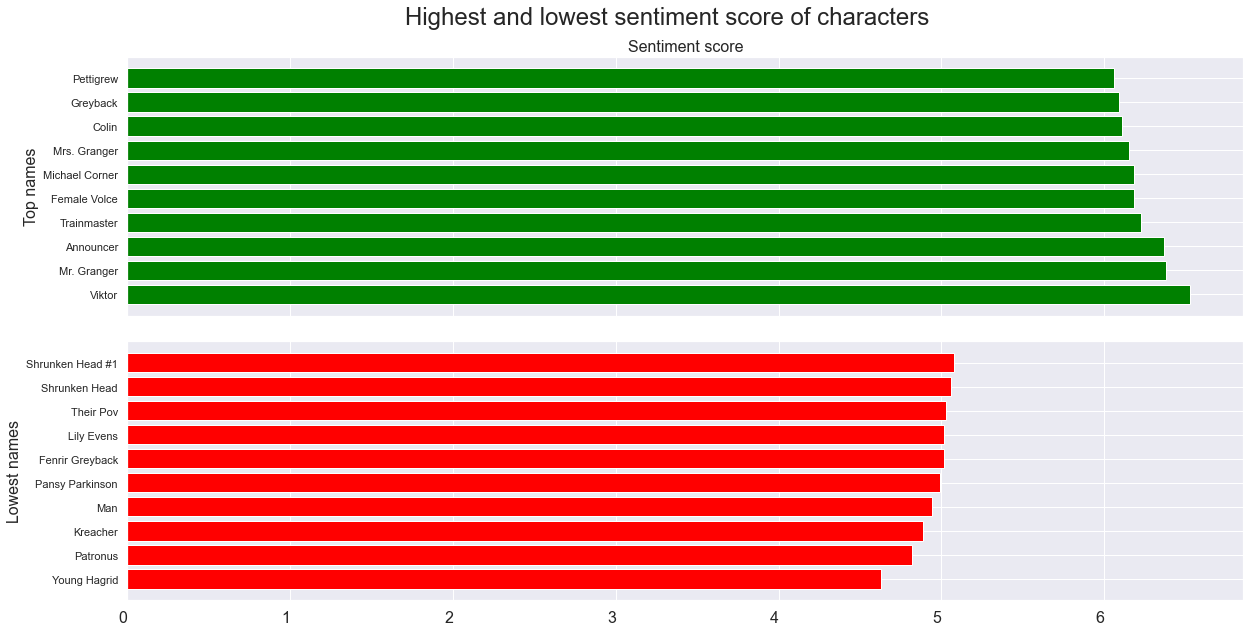
Now that we have a sentimental score for the characters, let's explore which main characters are the happiest:
We'll look at the characters with a degree of at least 100 (to avoid bias from small pages).
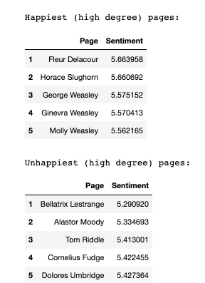
The tables above show the happiest 5 and unhappiest 5 WikiPages in the network, disregarding all nodes that do not have a degree of at least 100. The idea is that these are supposed to be widely known / main characters. Note that Tom Riddle sits in the 3rd unhappiest place, with Weasleys populating 3 out of the top 5 happiest pages. Bellatrix Lestrange is a villain, and Alastor Moody is impersonated to be one too. Fleur Delacour is a student that visits Hogwarts. These results do certainly make sense.
But what if we look at the different sentimental values between communities? The idea is simple: Use the same scoring as previously, but average the scores over the whole communities that they reside in. Note that for this part, we've named the communities by the top 3 largest nodes in terms of degree.
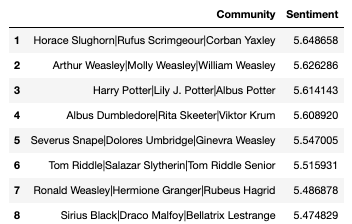
The table above shows the names of the communities along with their sentimental average, ordered by the value. In first place is a rather peculiar community of Horace Slughorn, Rufus Scrimgeor and Corban Yaxley. This is surprising given that Corban is a death-eater, and Rufus a Ministry of Magic beaurocrat. This is probably on account of Slughorn being scored very highly (2nd place of the top characters) in terms of sentiment. The Weasley community sits happily in second place, with Harry and his family third. Voldemort, along with all the legends in his community sit in 6th place, and surprisingly Ron, Hermione and Hagrid are in 7th. This could have to do with the creatures that they meet on their travels. In last place is the community with Draco Malfoy, Bellatrix Lestrange, and, perhaps unfittingly, Sirius Black.
Although the communities could be a bit clearer, the sentiment analysis made intuitive sense. The highest rated versus the lowest rated characters clearly shows a trend of the 'good' guys being happier than the 'bad' guys. Furthermore, the Weasley family seems to be doing quite well when it comes to sentiment. It seems like it is indeed good to be a Weasley.
Comparison - Term Frequency - Books vs. Movies
For the comparison, we gather the set of 10 most common words for the books and the top 10 most common words for the movies into a single set. Now the frequency of each of those words is extracted from the two frequency distributions. In order for the values to be comparible, it is necessary to normalize each value by so that the frequency of movie + book sums up to 100. That way all the values in the chart will sum up to the same value.
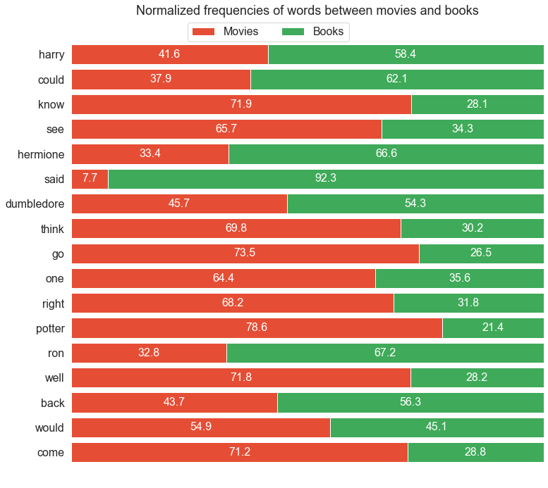
From the chart below some interesting things can be seen:
-
Harry is mentioned relatively more frequently in the books than in the films.
- This could have something to do with the fact, that whenever Harry says something in the books, it is usually noted that it was in fact Harry that said it. This is not necessary in the movies as they can visually show and audible distinquish what Harry is saying, and when Harry is being referenced.
- The distinction is even clearer for Ron and Hermione. Both characters are referenced much more frequently in the books.
- Again this could have something to do with the fact, that in the movies there might not be the need to mention the names, if the characters are looking at each other when speaking.
- When looking at the verbs could, know, see, said, think, go, would and come, the verbs in present tense are much more frequent in the movies, while the verbs in past tense are more frequent in the books. This is an interesting distinction between the two.
- Harry's last name Potter is mentioned much more in the films than it is in the books. This seems reasonable.
Since the above figure included a lot of relatively meaningless verbs, it's intersting to see the same graph, but now with the character names. That way it's possible to highlight the differences in how frequently the characters are mentioned.
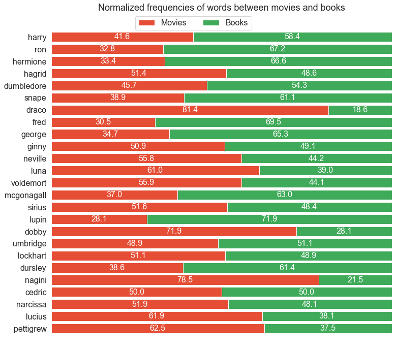
- It's interesting to see that Draco, Dobby and Nagini, are mentioned much more frequently in the movies than the books, all with ratios over 70%.
- The characters mentioned more frequently in the books than the movies are Dursley, Lupin, McGonagall, Fred, George, Snape, Ron and Hermione, all with ratios over 60%.
- The biggest difference is Draco having a much higher frequency in the movies than in the books. This could be attributed to the structure of cinema, where characters tend to be exaggerated and villainised more than in books.
Comparison - Sentiment - Books vs. Movies
It's also interesting to compare the sentiment values between the books and the movies. In order to do so, it is necessary to collect the sentiment from the books and the movies, and create a Moving Average window for both. The moving average for the books was decided to be 5 chapters. However, the moving average for the scenes was decided to be 30 scenes, as there are much more scenes in each movie, than chapters in each book.
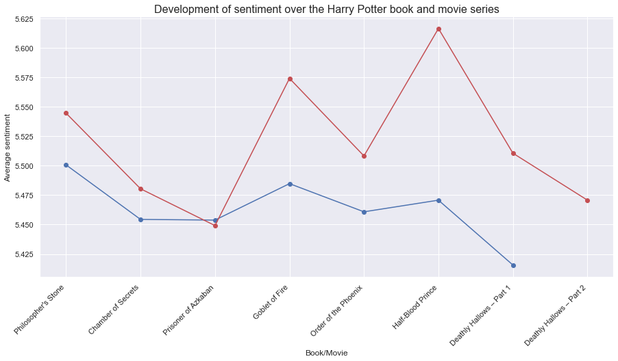
From the figure above it is clear that the movies always have a higher average sentiment than the books, apart from the third book/movie Prisoner of Azkaban.
The highest sentiment for the books occurs in the first one, while the last book has the lowest sentiment. This is not the case for the movies. The movie with the highest sentiment is Half-Blood Prince and the lowest one is Prisoner of Azkaban.
The movies fluctuate much more in their sentiment value than the books. However the sentiment value range is still relatively small.
To get a slightly better overview of the evolution of the sentiment, the sentiment analysis is broken down into a lower level. Now the books are broken up into chapters, and the movies are broken up into scenes.
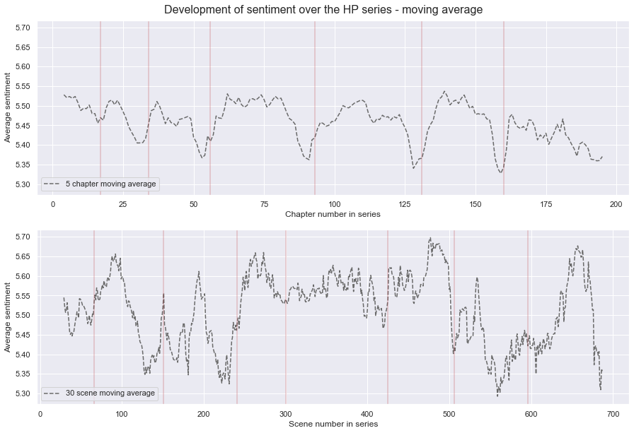
From the above graph it can be seen that the sentiment value of each book/movie changes over the course of the book/movie. So an average sentiment as shown previously misses out on a lot of information about how the sentiment evolves.
The red lines show where a book/movie ends and a new one begins. Most of the books have a similar trend. Where the sentiment begins pretty high and then fluctuates a bit and drops to the end of each book. Since the value displayed is a moving average, the drop at the end of one book can cause the beginning of the next book to be slightly lower than it would have been, if the books would have been examined individually.
The movies display a different trend. They fluctuate a lot more and have a higher range in difference in sentiment. So within the second movie the sentiment ranges from 5.35 to 5.65, while the same book has a range of 5.4-5.51. Most of the movies have a big range, the only expception being the fifth movie.
The last Harry Potter book was split into two films, and it's interesting to see that the sentiment trend for those two movies are very different.
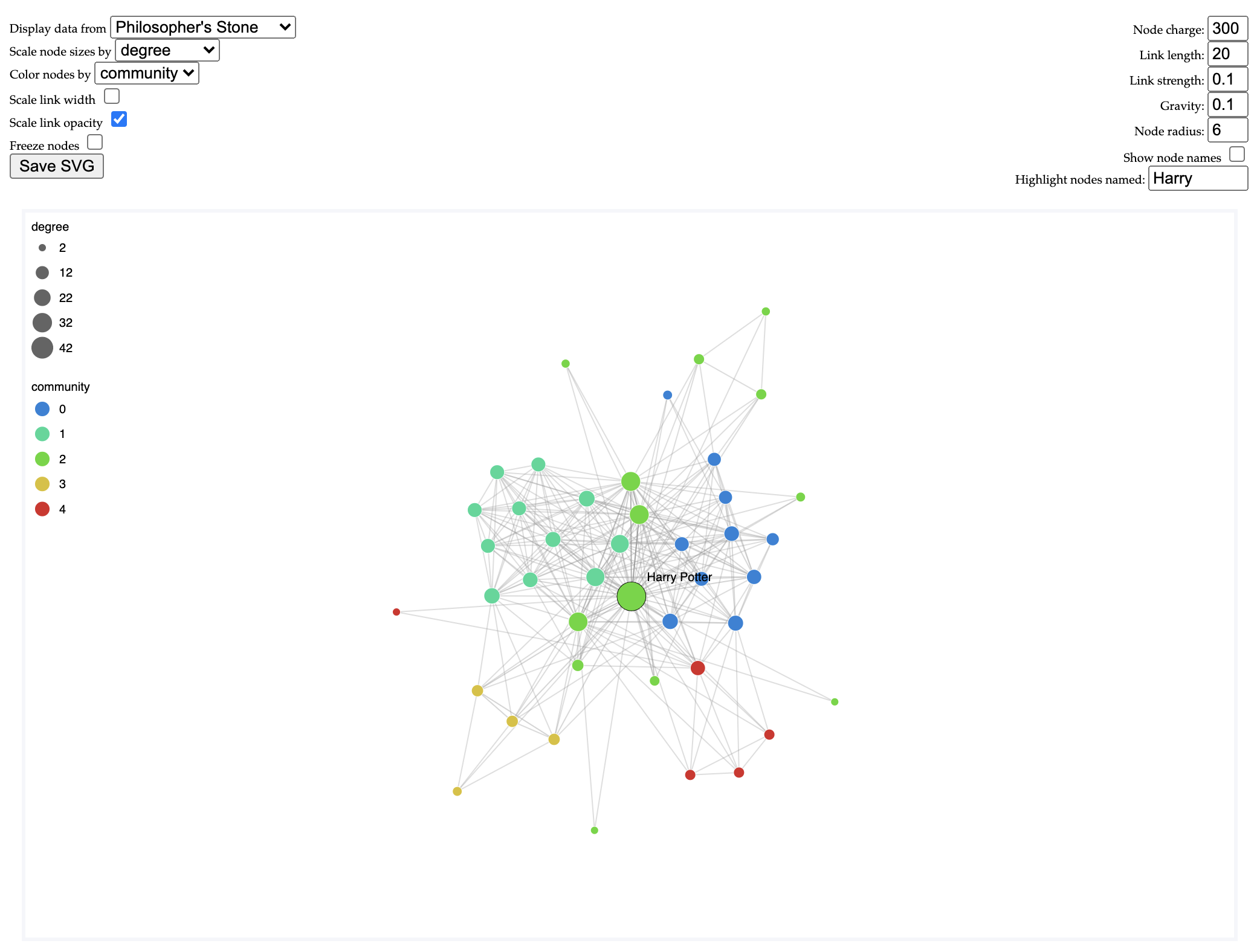
Interactive wiki network
Step in to the Harry Potter universe and take a look around! Here in the Wiki network we have firstly a GCC of the characters that have houses. Secondly, we have a network of all the characters included in the community detection section.
You can switch networks on the top left side (note that one is much bigger, so it could be heavy). You can scale the node sizes by various metrics, and colour the nodes by different attributes. Note that the legend could be a bit off (as it is limited here), but this is still interesting to see the difference in these attributes!
Try colouring the network by different attributes, can you find the lone Werewolf in the House network? Can you find the happiest WikiPages in the House network? What is the gender distribution in the communities network? You can also play around with the network settings in the top right corner!
Interactive movie network
Further explore the network generated from the movies! Click on the image to find out more!
Want to learn more?
Project B
This webpage is the final deliverable in the class Social Graphs and Interactions offered by the Technical University of Denmark. The point of the final project is for the students to try out the new skills they've learned on their own dataset.
More detailed information can be found in the explainer notebook the team created!
The Team
The team consists of three enthusiastic master students at DTU.

Hlynur
MSc Business Analytics
Kristín
MSc Business Analytics